Sunday, November 11, 2007
Book Cover
This is a book cover I designed for an informational text on the HPV virus and how it affects both men AND women. The cover text is taken from a government website. The author's name is fictional and is actually Portuguese for "Wake Up".
I did this for a History of Graphic Design class at the Art Institute.
Posted:
Sunday, November 11, 2007
0
comments
![]()
Thursday, November 08, 2007
Gig Posters

One art form I have lately fallen in love with is the Poster. Posters have an amazing history dating from the 1800's. The have become an art in their own right and have had a wide range of uses from advertising to propaganda to pure art. This particular piece is a gig poster based on a couple of real bands punk bands that I participated in many years ago as well as a fictional band. The Lounge and the production company are also fabricated for the poster. It is purely art and obviously not functional, but it was allot of fun to make!
On The Road To Shambala

The word Shambala has many meanings, from the name of a song to a mystical kingdom in the Himalayas. In the case of this piece, Shambala is defined in Sanskrit as a place of peace, tranquility, and or happiness. This work is a layout for an article in an alternative culture magazine. It was done as an assignment in class and has no corresponding article in actuality. I have an interest in Buddhism myself and that is why I chose this particular subject. The drawing in the background is one of my own, which can be seen on my website as an incomplete project. It worked pretty good in this piece though ;)
A Roman Holiday

I'd love to go to Rome! Mostly for the wine and scenery, not so much for romance.
Here I have a set of ideas for business card, created for the company: Roman Holiday Tours.
These are mostly for the purpose of practicing technique in advertising and representation of a company. I did the work not for profit, but for fun.
Saturday, October 06, 2007
The Cat

My final project for painting class was of our Persian cat, Nicky. He wouldn't sit still of course, so I worked this from a photograph. My instructor later told me that if i had said I was going to paint an animal that she would have discouraged me.
Posted:
Saturday, October 06, 2007
0
comments
![]()
Portrait Painting
This is my first time painting a portrait. I actually enjoyed doing this more than any of the previous painting projects. I was surprised at how easy this was. I feel like my past experience in portrait drawing has served me well here. As well I did a little research and found a wonderful artist's site. His name is Berkeley and his blog, A Berkeley Daily, has some very interesting videos showing him at work (in fast motion) on various paintings including portraits. These and a book called "Art Class" really helped me put the lectures together with actual practice.
Posted:
Saturday, October 06, 2007
0
comments
![]()
Painting...
Much has happened since my last postings. I started a painting class and finished it. At first I was apprehensive, thinking that there was no way I would do good in a painting class, as I am not at all used to this medium. It turns out that it was allot of fun and I quickly changed my mind as the class progressed. Painting, it turns out, is very time consuming. I chose to use acrylics for these works due to time restraints (mostly in terms of drying time).
These first images are all basically warm ups and studies in color and form. They include traditional still life setups of fruits, bottles, and other ordinary items.


 After these simple paintings came multiple still life objects...


Then came flowers. I found these to be a weak point for me.
Posted:
Saturday, October 06, 2007
0
comments
![]()
Saturday, August 04, 2007
Playing with text effects


These are a couple of things I came up with while playing around with text effects in Photoshop. The fire was a standard that we were shown in class. After seeing that I found an ice tutorial and took some shortcuts to make it simpler. The fireworks was inspired by a radioactive effect I found.
Posted:
Saturday, August 04, 2007
0
comments
![]()
Sunday, July 29, 2007
Dark Wood
I've been wondering what to work on next outside of school. Out of a number of projects I started, I was sidetracked by a photo of our front lawn. After some playing around with it I settles on this rendition. Influences from the likes of Stephen King, Creepshow, and H.R. Giger were running through my mind I suppose.
I have a thing for stuff that is creepy and haven't worked with it much lately. My next projects may or may not be along these lines...
Posted:
Sunday, July 29, 2007
0
comments
![]()
Thursday, July 26, 2007
What's for dinner?
Here is one I did while practicing layers in Photoshop. The original pictures looked nothing like this of course!
Posted:
Thursday, July 26, 2007
0
comments
![]()
Thursday, July 05, 2007
New blog
My wife just started a new blog. This is the first one she has done and she seems to be enjoying it.
The link is katiedance.blogspot.com
This blog is actually my second, since I accidentally erased the first one! (DUH!) It has been a cool way to share my experiences and thoughts about things. It has also been interesting to see all the people who check out the site and where they are from. I have had hits from all over the world, some who actually looked at my website first or did a direct search for this blog. Some of the hits have been from family, some from fellow posters in forums and some from random search hits, where they were looking for something else but found this!
After all these hits I have actually only had 3 or 4 comments. Thats karma for you (I never comment on other peoples blogs!). Oh well ;)
Anyways, check out her blog, she is a fun girl and I love her!
~~~
Posted:
Thursday, July 05, 2007
0
comments
![]()
Website
I went ahead with the website I was working on for my friend. The name we wanted was taken and the people who bought it wanted $14,000 for it! I had to laugh and told them to take a flying leap! We settled on www.dkconstructionpro.com
It was done as a layout in photoshop originally, so putting it to html was a bit different than I am used to. It took about 5 hours to get the basic layout and to set up the email accounts and server settings.
Not too bad...
Posted:
Thursday, July 05, 2007
0
comments
![]()
Monday, June 18, 2007
Website
After showing my "customer" the magazine ad, he stated that he thought it would look good as a main page for a website. When given the assignment to design the layout for a site, I used the magazine ad as a (very) rough draft for the layout. This was the resulting front page:
Posted:
Monday, June 18, 2007
1 comments
![]()
Promo T-Shirt Container
I designed a t-shirt container about the size of a container of tennis balls for a promotional give-away item at trade shows. This was done in Illustrator and then finally rendered in Bryce as a 3-D object.
The actual assignment was rendered in Illustrator with an example label (below).
Posted:
Monday, June 18, 2007
0
comments
![]()
Magazine Ad
Magazine ads are much more fun to work with for me. They are in color! Although the newspaper ads were in b&w, they were quite challenging due to the nature of the format restrictions and type restrictions. All of the ads were created with InDesign and Photoshop with prep work in Illustrator.
Posted:
Monday, June 18, 2007
0
comments
![]()
Newspaper Ads

These are the three newspaper ads I came up with for my class. They are laid out in accordance with newspaper column standards. They are in order: 1, 2 and 3 column ads.
Posted:
Monday, June 18, 2007
0
comments
![]()
I'm back!
Ok I have been AWOL for over a month now (as if anyone noticed!). I have been working on projects for my Electronic Design course. Mostly logo work, newspaper ads, magazine ads, and web layout.
I have included a sample of the logos I designed for a local company int his post and will be adding more posts containing other types of examples shortly. This company is belongs to a friend of mine. I figured since I the projects would be of this type that I might as well make them useful! So far he has liked everything I showed him from the class. Most of the class was intensive use of Photoshop, Illustrator, and InDesign.
Posted:
Monday, June 18, 2007
0
comments
![]()
Tuesday, May 15, 2007
Clear 3D Project

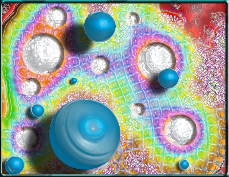
This was done for my typography class. It was a pain in the @$$ as you might imagine. I discovered that the best glue for putting together clear plastic is Testors Clear Parts & Window Maker cement. Takes awhile to dry but dries like glass, no residue or fogginess! Had to learn that the hard way after trashing the first project due to cloudy residue in the globes.
Posted:
Tuesday, May 15, 2007
0
comments
![]()
Tuesday, April 24, 2007
Tuesday, April 17, 2007
Decriminalize
 This was a project for my typography class. My first use of Adobe InDesign ( a wonderful program by the way).
The subject matter does reflect my personal views. Check out this former Seattle Police Chief's article.
Posted:
Tuesday, April 17, 2007
0
comments
![]()
Wednesday, April 11, 2007
Saturday, April 07, 2007
Ra's Bar & Grill

Another drawing for the Paizo art challenge...
This one was to include a mummy, ice, and a potion. What better place for these than the local undead tavern!
Posted:
Saturday, April 07, 2007
0
comments
![]()
Wednesday, March 28, 2007
Terrible Heights

This is a project I created for an RPG posting forum on paizo's website.
Talk about fun! I got totally wrapped up in this.
Posted:
Wednesday, March 28, 2007
0
comments
![]()
Saturday, March 24, 2007
Autoduel Quarterly
This was my final project for Visual Indication. This is a custom cover for a magazine created by Steve Jackson Games as a supplement for their Car Wars board game. The magazine, entitled "Autoduel Quarterly" ran for about 10 years. It is now out of print but is available in HTML and PDF format. The original 'zine was a very small and simple publication, printed first in two colors then later in up to four colors. My version follows the later issues' style, in terms of layout, but includes a fuller color range. I really enjoyed this venture and am planning on trying my hand at further similar projects.
Here it is:
Posted:
Saturday, March 24, 2007
0
comments
![]()
Sunday, March 18, 2007
Dragon
This week we were required to create a full page layout including text. Since I am a long time fan of Dungeons and Dragons, I decided to take a blast from the past and create a fictional "Dragon Magazine" cover.
Posted:
Sunday, March 18, 2007
1 comments
![]()
Another Perspective
So these last two weeks we covered Perspective drawing again. I have already had that class so it wasn't too difficult. A bunch of cubes to make sure we understood the ideas of one-point and two-point perspective and then a couple of scenes done in both ways. This one was my favorite; drawn in two-point..jpg)
Posted:
Sunday, March 18, 2007
0
comments
![]()
Thursday, February 22, 2007
Visual Indication
So I have started a new class in school entitled "Visual Indication". Basically we are learning how to use professional markers create presentations. I have found out that markers are not the easiest medium to use. Unlike pencils, they DON'T ERASE! Okay, okay, this should have been obvious.
So I started practicing with them and for my first assignment drew some objects that might be found in a witch's house. I still have allot of practice to go before I will be able to get good at coloring with these.
So here is the drawing---.jpg)
Let me know what you think!
Wednesday, February 14, 2007
Ubuntu
I decided to repartition my hard drive last night and this morning I installed Ubuntu Linux on the new partitions. I have used Linux in various forms over the years (Red Hat, LinuxPPC on a Mac, Debian) and I like the OS. Unfortunately I cannot get my latest peripherals to work under Linux. My printer/scanner is a Lexmark and they offer little to no support for Linux on their website. I have also not been able to find much on this particular model (x3350) on the internet. It is sad that this would be the only reason for me to continue using Windows XP (which is a drag allot of the time).
Besides this single issue, Ubuntu booted up fine and I was able to get my wireless card to work with very little effort. Web pages came up fast and clean, blowing away Windozzzzzz.... I still wonder if I can get our cell phones to connect though. My wife and have a Motorola RAZR V3 and a Sony Ericcson w300i respectively, both of which connect with USB cables and have drivers in Windows.
If anyone has any info on this, throw me a line. I am eager to migrate to Linux but I cannot afford all new peripherals and don't want to lose the niceties of being able to load my cell phone pics and music directly to my pc.
Anyways, more if I find it...
Self Portraits
.jpg)
We had to draw a large sized self portrait our final project in Life Drawing. This one is about 30 inches by 12 inches. It took me about 4 or 5 hours to complete and then another hour to scan in (in pieces) and put back together in reasonable condition.
It was a long process but I had allot of fun at this. It has encouraged me in my ability to draw people.
Friday, February 09, 2007
Killer Albums
Legion Of Boom - Crystal Method
Urban Jungle - Aphrodite
Lest We Forget - Marylin Manson
Sinister Nostalgia - Switchblade Symphony
Had to add these on the rebound
Posted:
Friday, February 09, 2007
0
comments
![]()
Favorite Music
Felt like posting a list of my favorite tunes this week...
Allot of it is in the genre "House" (which btw is my favorite TV show, the guy is harsh!)
but there is a bit of everything here
It Just Won't Do - Tim Deluxe/Sam Obernik
Bitch - Dave McCullen
Fast Cars - Hellbent
Nothing But You - Paul Van Dyk
The Things You Say (Dirty South Remix) - Cicada
Wonderful Night - Fatboy Slim
Faster Kill Pussycat - Brittany Murphy/Paul Oakenfold
The Streets (Feat Bun B.) - 8Ball & MJG
Cervix Couch - Christian Death
These Boots Are Made for Walkin' [Bombs Remix] - KMFDM
Long Hard Road Out of Hell - Marilyn Manson
Round and Round - Ratt
Sweat - Tool
Makes one hell of a list if you have these tunes... otherwise download soulseek and find them!
Posted:
Friday, February 09, 2007
0
comments
![]()
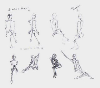
Hands and Feet
Now we are looking at the surface areas... these are actually my own hand and foot. Pardon the hair!
yeah I know, I didn't do that great a job on the hand. my thumb looks bizarre doesn't it?? lol
Posted:
Friday, February 09, 2007
0
comments
![]()
Saturday, February 03, 2007
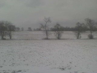
First Snow
Serenity Sunrooms Banner
I recently reworked a website for Serenity Sunrooms. The site will be published in it's new form shortly.
I had to do some digging to find the font they liked. Turns out they like my banner logo better than their original square logo, which I also redrew and vectorized.
Here is the banner--
Original logo--
Vectorized Logo--


.jpg)


